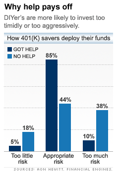
This popular article references a report by financial consulting firms that makes a fairly convincing argument (even though they mostly neglect inferential statistics, and some parts of their argument are misleading, or otherwise not convincing) that 401(k) participants who accept "help" from financial experts take less risk and have better returns than those who do not accept "help".
Unfortunately, the news article chose one of the least convincing graphics to summarize this finding, which is reproduced above (from screen capture). In the report, the principal comparison is drawn between 401(k) participants who accept "help" versus those who do not. However, from the report:
In this report, the majority of Help Participants had risk levels in the 10% to 18% range [footnote 15]. We use this range as our proxy for "appropriate" risk levels, which are consistent with diversified portfolios combining equity and fixed income holdings.
[footnote 15] This range represents approximately 85% of participants using Help.
Rather than select the range 10% to 18% directly (as the report leads us to believe by relegating the other pertinent information into a footnote), I suspect that the authors simply selected the range corresponding to 85% of participants "using Help". Of course, such a "proxy for 'appropriate' risk levels" would be completely biased and self-serving! Indeed, the report authors might have selected a range corresponding to 90% of participants "using Help". If the "appropriate" risk range had some external validity, why would the authors hide (in a footnote) the fact that 85% of participants who used "help" had risk within this range?