I frequently use lattice and ggplot2 to create trellis/faceted graphics. But, I gave up using these packages in a recent application, where I had initially constructed a complex graphic using the base R plotting functions. When I later decided that I wanted a faceted version, there was a dilema: re-create the complex graphic using lattice or ggplot2, or implement a faceted version using base R graphics functions. The latter was my solution for the problem at hand. I imagine that I am not the first, nor last, to encounter this problem. Hence, this post describes my solution, and gives a general recipe for faceting graphics using only base R graphic functionality.
Below is the type of graphic that I had initially created. It's a binary calibration plot; it plots model predictions (probabilities) against empirical estimates of the outcome probability using a kernel smoother. The kernel smoother isn't optimal because it's prone to bias, especially near the extreme predictions. This is clear in the figure below, near the origin. Although the simulated data are perfectly calibrated, the figure might lead us to conclude otherwise for predictions near zero. A 95% pointwise confidence band, and a (inverted) histogram of model predictions are also displayed.
> set.seed(42)
> x <- rbeta(5000, 1, 5)
> y <- rbinom(5000, 1, x)
> calib(y, x, sx = seq(min(x), max(x),
+                      length.out=100))

For completeness, listed below are the two functions that implement the kernel smoothing and calibration plot, respectively. However, the recipe for faceting with base R, outlined below, is agnostic to the type of plot used.
# binary kernel smoothing, with pointwise confidence band
# y - vector of binary outcomes
# x - vector of probabilities
# bw - bandwidth
# sx - values of x where p(y|x) is estimated
# conf - confidence level for pointwise confidence band
bks <- function(y, x, bw = 0.0075,
                sx = x, conf = 0.95) {
  # normal kernel estimate
  lsx   <- length(sx);
  lx    <- length(x)
  kmat  <- matrix(rep(x, lsx), lsx, lx, TRUE)
  wts   <- exp(-(kmat - sx)^2/bw)
  rsm   <- rowSums(wts)
  sms   <- wts %*% y
  est   <- sms / rsm

  # Clopper-Pearson intervals
  clo   <- qbeta((1-conf)/2, sms, rsm - sms + 1)
  chi   <- qbeta(1-(1-conf)/2, sms + 1, rsm - sms)
  list(x = sx, est = est,
       clo = clo, chi = chi, conf = conf)
}

# Calibration curve
# y - vector of binary outcomes
# x - vector of probabilities (predictions)
# bw - bandwidth
# sx - values of x where p(y|x) is estimated
# conf - confidence level for pointwise confidence band
calib <- function(y, x, bw = 0.0075,
                  sx = sort(x), conf = 0.95, ...) {
  ox <- order(x)
  x  <- x[ox]
  y  <- y[ox]
  bf <- bks(y, x, bw, sx, conf)
  hx <- hist(x, breaks=100, plot=FALSE)
  hx$counts <- hx$counts/sum(hx$counts)
  plot(hx$mids, hx$counts,
       ylim=c(1,0),
       xlim=c(0,1),
       type='h', ann=FALSE,
       yaxt='n', xaxt='n', bty='n')
  par(new=TRUE)
  plot(bf$x, bf$est, type="n",
       xlim = c(0,1),
       ylim = c(0,1),
       xlab = "Model",
       ylab = "Empirical", ...)
  lines(range(bf$x),range(bf$x),col="darkgray")
  lines(bf$x, bf$est, lty=1)
  lines(bf$x, bf$clo, lty=2)
  lines(bf$x, bf$chi, lty=2)
}
The conventional approach to faceting using base R functionality is to arrange whole plots (i.e., including titles, axes, and labels) in a rectangular array within a single figure. This is accomplished, for example, by setting the mfrow or mfcol parameters using the par function, or by using the layout function. The result is something similar to the following:
> par(mfrow=c(2,2))
> replicate(4, {
+   x <- rbeta(5000, 1, 5)
+   y <- rbinom(5000, 1, x)
+   calib(y, x, sx = seq(min(x), max(x),
+                        length.out=100))
+ })

The mfrow solution is not optimal in this application, for several reasons that I won't mention here. This brings me to my solution:
- Set an outer margin to be used for labels and axes.
- Eliminate the inner margin.
- Use mfrow/mfcol.
- For each plot:
- Create a plot without titles, axes, or labels.
- Add titles, axes, and labels manually.
> CalibPlot <- expression({
+   x <- rbeta(5000, 1, 5)
+   y <- rbinom(5000, 1, x)
+   calib(y, x,
+         sx = seq(min(x), max(x),
+                  length.out=100),
+         xaxt="n", yaxt="n")
+ })
>
> par(omi=rep(1.0, 4), mar=c(0,0,0,0), mfrow=c(2,2))
>
> #1,1
> eval(CalibPlot)
> mtexti("Column I", 3)
>
> #1,2
> eval(CalibPlot)
> mtexti("Column II", 3)
> mtexti("Row I", 4)
>
> #2,1
> eval(CalibPlot)
> axis(1)
> mtexti("Model Probability", 1, 0.75)
> axis(2)
> mtexti("Empirical Probability", 2, 0.75)
>
> #2,2
> eval(CalibPlot)
> mtexti("Row II", 4)

The function mtexti (not defined here) behaves similarly to mtext. I recently wrote about mtexti (see post 2522). There are many ways in which to style and automate the faceted version. I've elected to put the axes and axis labels on the bottom-left figure only, which has some drawbacks. Hence, I haven't made much effort to encapsulate this recipe for faceting within a function, since I'm not quite sure how to best display the axes, etc.
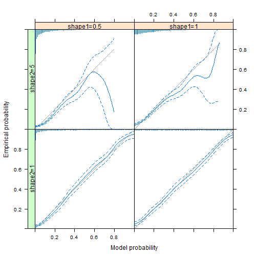
In a comment below, Sebastian gives code for the lattice version, which is easier that I had thought. Here is the result:
Hello!
Just to provide some similar lattice code (which I prefer) so that it is easier to compare the different options to make such a plot:
# binary kernel smoothing, with pointwise confidence band
# y - vector of binary outcomes
# x - vector of probabilities
# bw - bandwidth
# sx - values of x where p(y|x) is estimated
# conf - confidence level for pointwise confidence band
bks <- function(y, x, bw = 0.0075,
sx = x, conf = 0.95) {
# normal kernel estimate
lsx <- length(sx);
lx <- length(x)
kmat <- matrix(rep(x, lsx), lsx, lx, TRUE)
wts <- exp(-(kmat - sx)^2/bw)
rsm <- rowSums(wts)
sms <- wts %*% y
est <- sms / rsm
# Clopper-Pearson intervals
clo <- qbeta((1-conf)/2, sms, rsm - sms + 1)
chi <- qbeta(1-(1-conf)/2, sms + 1, rsm - sms)
list(x = sx, est = est,
clo = clo, chi = chi, conf = conf)
}
# Calibration curve
# y - vector of binary outcomes
# x - vector of probabilities (predictions)
# bw - bandwidth
# sx - values of x where p(y|x) is estimated
# conf - confidence level for pointwise confidence band
calib <- function(y, x, bw = 0.0075,
sx = sort(x), conf = 0.95, ...) {
ox <- order(x)
x <- x[ox]
y <- y[ox]
bf <- bks(y, x, bw, sx, conf)
hx <- hist(x, breaks=100, plot=FALSE)
hx$counts <- hx$counts/sum(hx$counts)
panel.points(hx$mids, 1 - hx$counts,
origin = 1,
type='h', ann=FALSE,
yaxt='n', xaxt='n', bty='n')
panel.lines(range(bf$x),range(bf$x),col="darkgray")
panel.lines(bf$x, bf$est, lty=1)
panel.lines(bf$x, bf$clo, lty=2)
panel.lines(bf$x, bf$chi, lty=2)
}
dat <- expand.grid(ID = 1:5000, shape1 = c(1, 0.5), shape2 = c(1, 5))
dat$x <- rbeta(nrow(dat), dat$shape1, dat$shape2)
dat$y <- rbinom(nrow(dat), 1, dat$x)
dat$shape1 <- factor(dat$shape1)
dat$shape2 <- factor(dat$shape2)
useOuterStrips(
xyplot(y ~ x | shape1 + shape2, data = dat,
xlab = 'Model probability',
ylab = 'Empirical probability',
xlim = c(0, 1), ylim = c(0, 1),
panel = function(x, y, ...) {
calib(y, x, sx = seq(min(x), max(x),
length.out=100))
}),
strip = strip.custom(strip.name = TRUE, sep = '='),
strip.left = strip.custom(strip.name = TRUE, sep = '='))
Best greetings, Sebastian
Hello!
Just to provide some similar lattice code (which I prefer) so that it is easier to compare the different options to make such a plot:
# binary kernel smoothing, with pointwise confidence band
# y - vector of binary outcomes
# x - vector of probabilities
# bw - bandwidth
# sx - values of x where p(y|x) is estimated
# conf - confidence level for pointwise confidence band
bks <- function(y, x, bw = 0.0075,
                sx = x, conf = 0.95) {
  # normal kernel estimate
  lsx   <- length(sx);
  lx    <- length(x)
  kmat  <- matrix(rep(x, lsx), lsx, lx, TRUE)
  wts   <- exp(-(kmat - sx)^2/bw)
  rsm   <- rowSums(wts)
  sms   <- wts %*% y
  est   <- sms / rsm

  # Clopper-Pearson intervals
  clo   <- qbeta((1-conf)/2, sms, rsm - sms + 1)
  chi   <- qbeta(1-(1-conf)/2, sms + 1, rsm - sms)
  list(x = sx, est = est,
       clo = clo, chi = chi, conf = conf)
}

# Calibration curve
# y - vector of binary outcomes
# x - vector of probabilities (predictions)
# bw - bandwidth
# sx - values of x where p(y|x) is estimated
# conf - confidence level for pointwise confidence band
calib <- function(y, x, bw = 0.0075,
                  sx = sort(x), conf = 0.95, ...) {
  ox <- order(x)
  x  <- x[ox]
  y  <- y[ox]
  bf <- bks(y, x, bw, sx, conf)
  hx <- hist(x, breaks=100, plot=FALSE)
  hx$counts <- hx$counts/sum(hx$counts)
  panel.points(hx$mids, 1 - hx$counts,
               origin = 1,
       type="h", ann=FALSE,
       yaxt="n", xaxt="n", bty="n")
  panel.lines(range(bf$x),range(bf$x),col="darkgray")
  panel.lines(bf$x, bf$est, lty=1)
  panel.lines(bf$x, bf$clo, lty=2)
  panel.lines(bf$x, bf$chi, lty=2)
}

dat <- expand.grid(ID = 1:5000, shape1 = c(1, 0.5), shape2 = c(1, 5))
dat$x <- rbeta(nrow(dat), dat$shape1, dat$shape2)
dat$y <- rbinom(nrow(dat), 1, dat$x)
dat$shape1 <- factor(dat$shape1)
dat$shape2 <- factor(dat$shape2)

library("lattice")
library("latticeExtra")
useOuterStrips(
  xyplot(y ~ x | shape1 + shape2, data = dat,
         xlab = "Model probability",
         ylab = "Empirical probability",
         xlim = c(0, 1), ylim = c(0, 1),
         panel = function(x, y, ...) {
           calib(y, x, sx = seq(min(x), max(x),
                                length.out=100))
         }),
  strip = strip.custom(strip.name = TRUE, sep = "="),
  strip.left = strip.custom(strip.name = TRUE, sep = "="))
Best greetings, Sebastian
Thanks for sharing this. It's easier that I had thought. I've uploaded an image of the result into the post above.
Thanks for uploading the graphics! Fortunately, your code was already very "lattice-ready" 😉
Best greetings,
Sebastian